


Why This Photo Works: A Deconstruction of Walk the Line
Let's break down the specific ingredients—leading lines, contrast, negative space, and the so-called 'rules'—that turn a simple snapshot into a compelling piece of art.

So, you’ve taken a photo. Brilliant. You point your fancy camera-phone thingy at something, the little box on the screen goes green, and you press the button. Job done. You’re practically Ansel Adams, right?
Wrong. So deeply, painfully wrong.
Most of the time, that approach gives you a photo that’s about as inspiring as lukewarm, instant coffee. It’s technically a thing, but nobody’s happy about it. But every now and then, you capture something that just… works. You might not even know why. It just feels right.
This is one of those photos. And today, fuelled by a dangerously strong brew, I’m going to break down exactly why it works. Because unlike your cousin’s holiday snaps, this wasn’t an accident. It’s a careful blend of ingredients, just like a perfect flat white.
Let's Start with the Obvious: Leading Lines
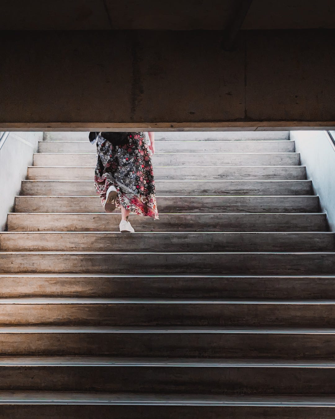
Your eye isn’t just wandering around this image aimlessly, is it? No. The moment you look at it, the bright white lines on those stairs grab your vision and drag it upwards. They create a powerful, unavoidable path.
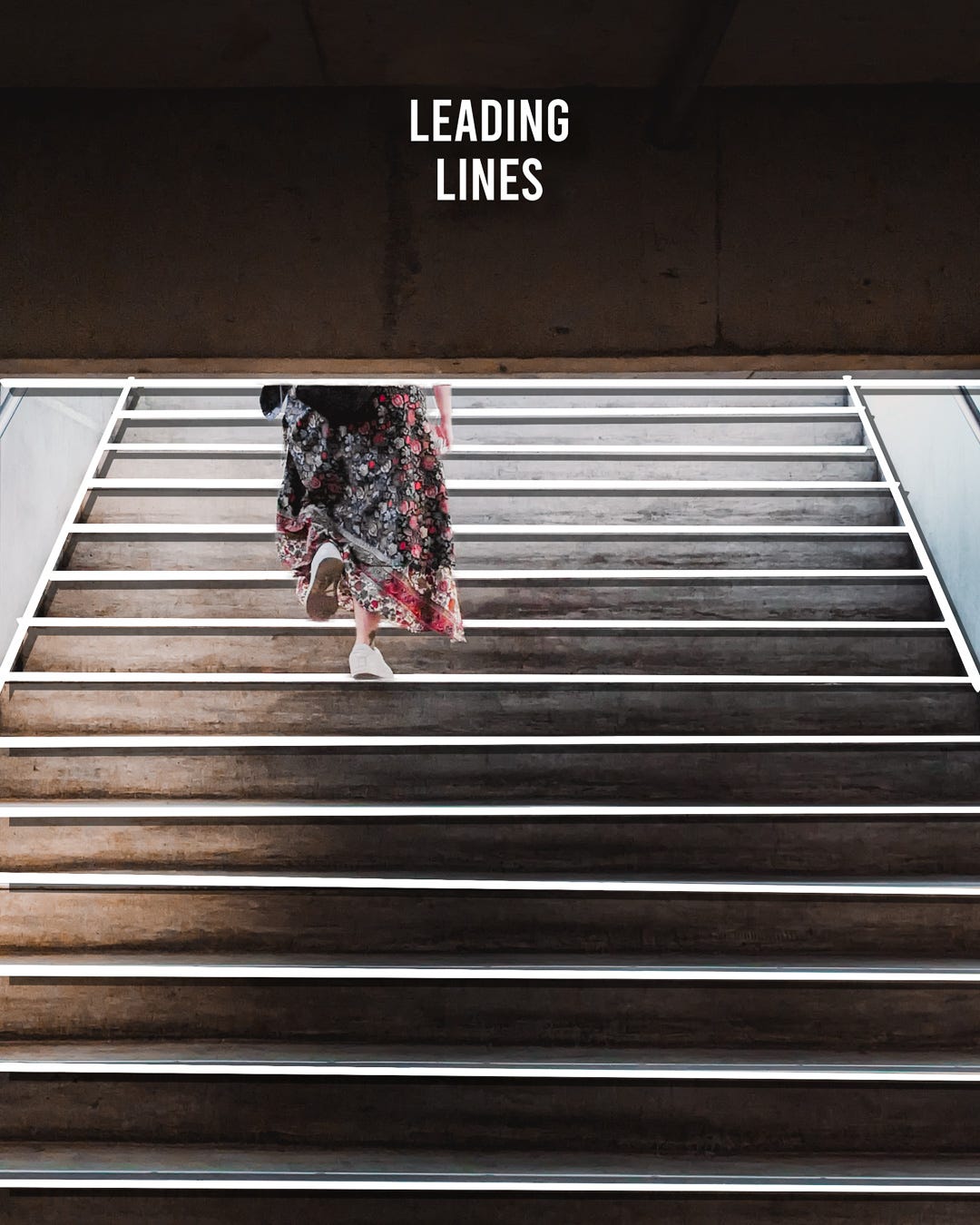
These are leading lines. They are the visual equivalent of someone grabbing your hand and saying, "Oi, look over here." In this case, they all point directly towards our subject, the person walking up the stairs. You can't not look at her. It’s a simple, brutally effective way to control where your viewer looks first.
The So-Called "Rule" of Thirds
I prefer to call it the "Guideline of Thirds," because I'm an artist and I don't like being told what to do. But for the sake of argument, let's talk about the rule of thirds.
Imagine you draw two horizontal and two vertical lines over your photo, like a noughts and crosses board. The idea is to place your important bits on those lines, or even better, where the lines intersect. It’s photography 101.
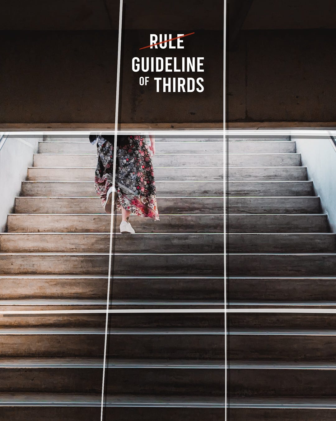
Look where our subject is. Not dead centre. Never dead centre. Putting your subject in the middle is like serving a single, lonely piece of biltong on a massive platter. It’s boring and lacks balance. Here, she is placed perfectly along the left vertical line, creating a much more dynamic and visually interesting image. It gives the rest of the photo room to breathe.
Speaking of which…
The Glorious Emptiness of Negative Space
What is the subject of this photo? Is it the person? The stairs? The darkness?
Yes.
The big, dark, empty area at the top and the lines of the stairs in the foreground are just as important as the person walking on them. This is negative space. It’s the "nothing" in the photo that gives context and power to the "something."
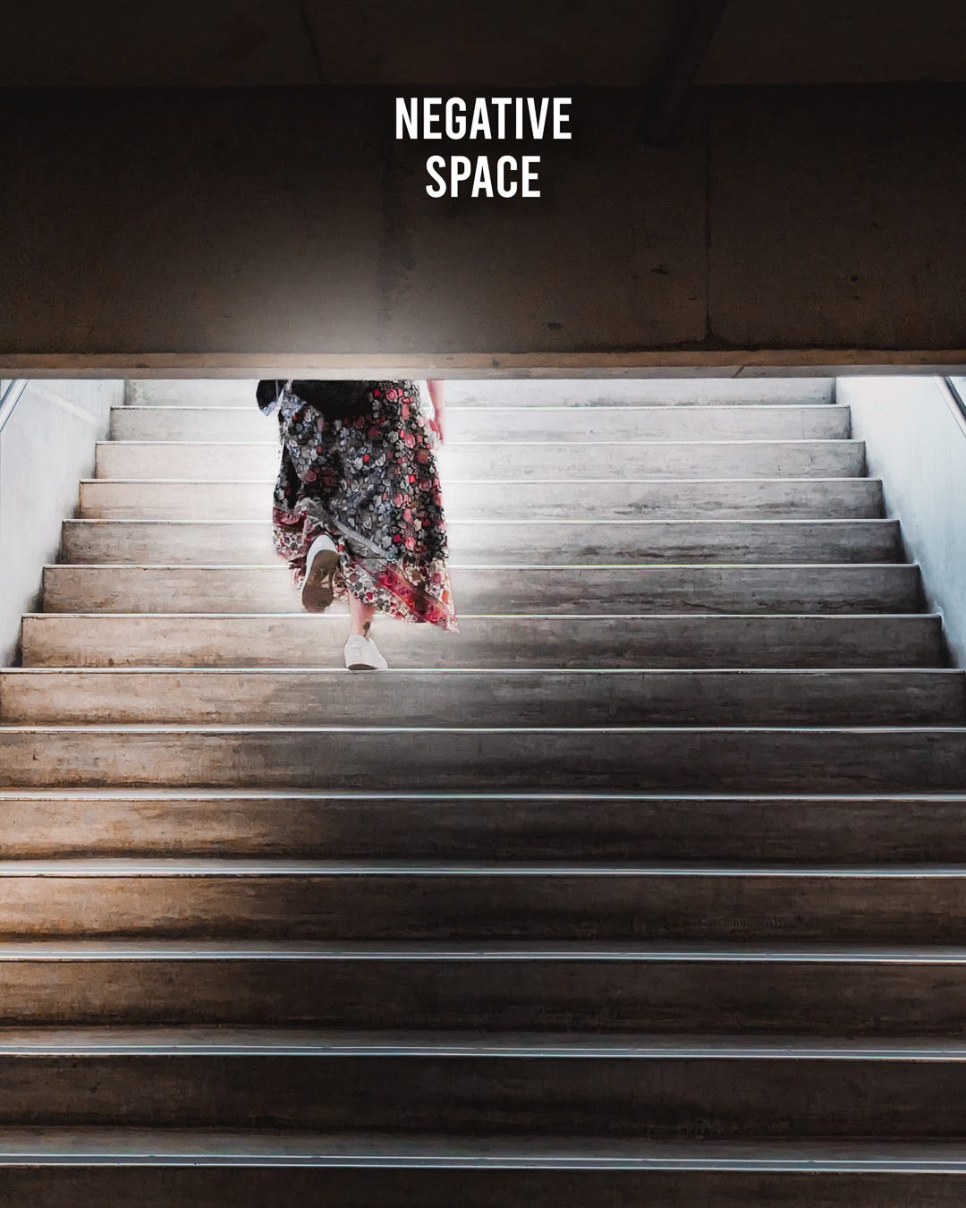
Without that dark, oppressive block at the top, the image would feel less intimate, less focused. The negative space frames the subject and adds to the mood. It tells a story of ascent, of moving from one place to another. It’s the quiet that makes the noise matter.
Let's Talk Tone and Colour
Contrast is the salt and pepper of photography. You need it.
First, tonal contrast. This is the difference between the light and dark areas of the image. Here, it’s not subtle. We have bright, almost-white steps set against deep, dark shadows.
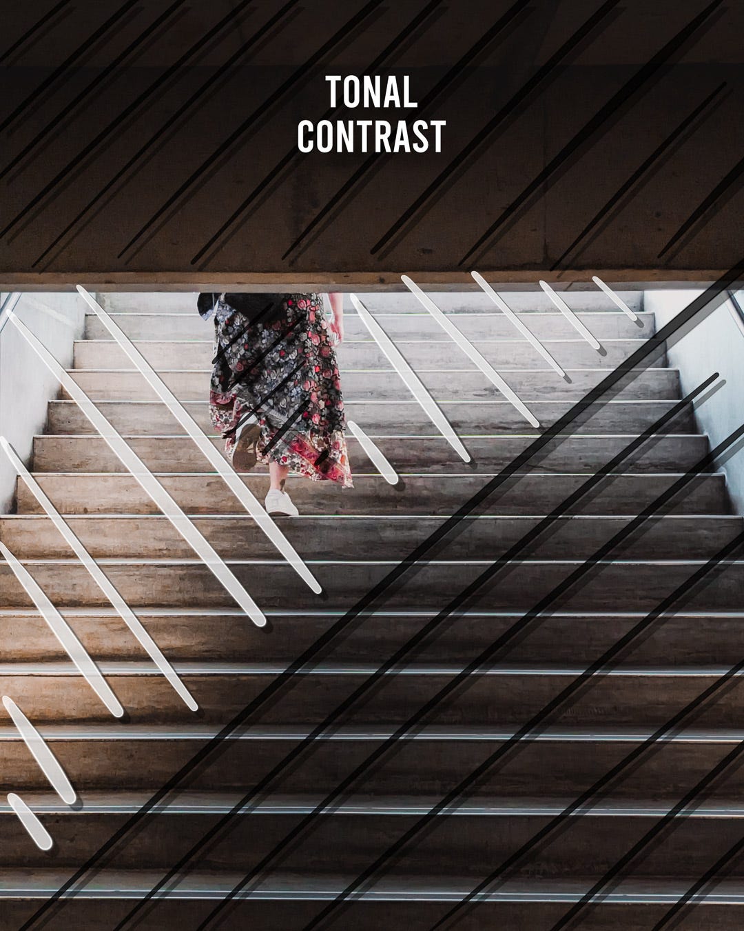
This stark difference creates drama and depth. It makes the lines pop and gives the whole scene a bold, graphic quality. It’s what makes the image feel punchy instead of flat.
Then there’s the colour contrast. The entire scene is made up of muted, earthy, and monochrome tones—greys, browns, blacks. And then… BAM. That pop of floral red and pink in the subject's skirt.
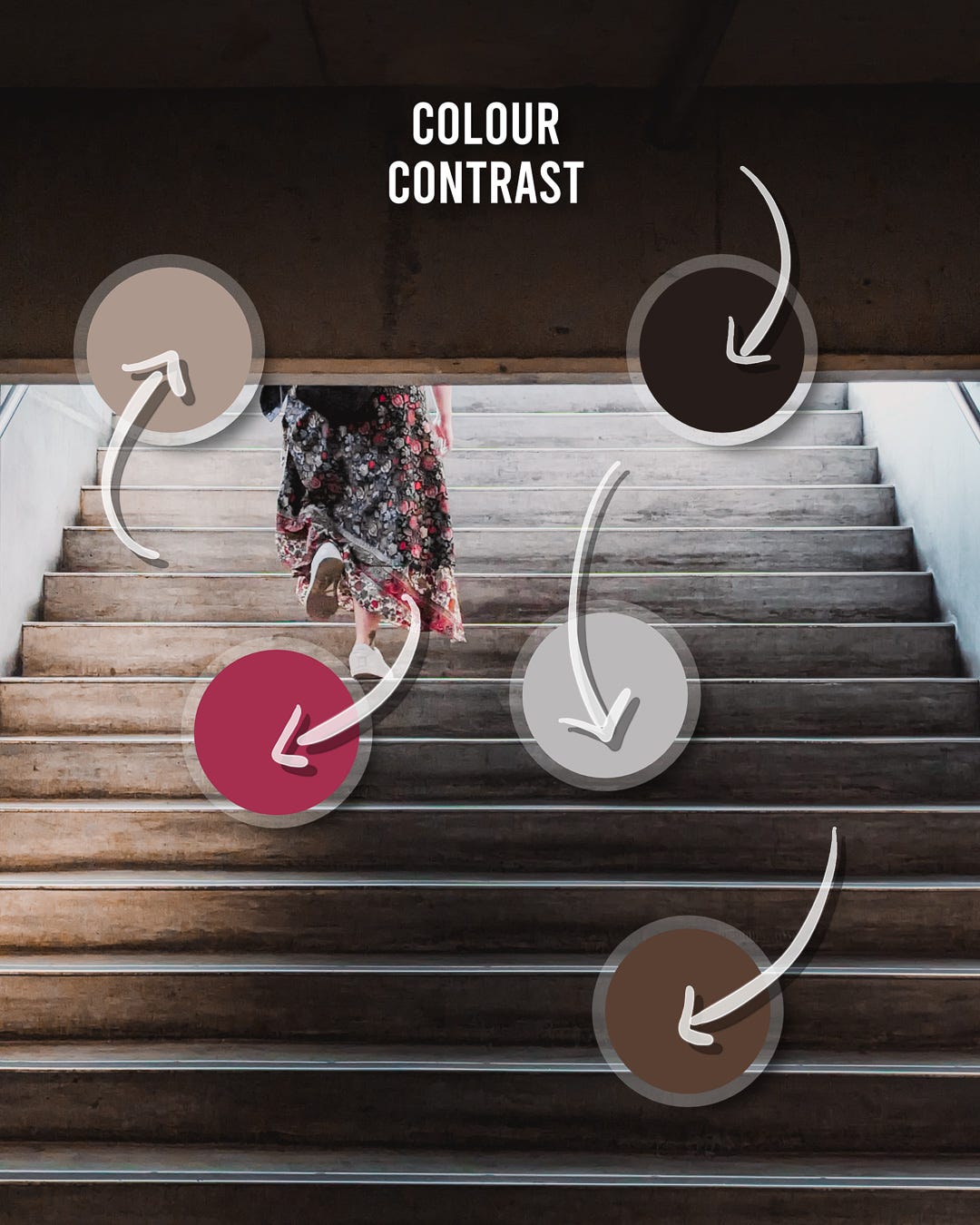
It’s not loud, but it doesn't have to be. Against the neutral background, that little bit of colour acts as a magnet for the eye. It reinforces the subject as the most important element in the frame. It's the final, perfect dusting of chocolate on the cappuccino.
So, Why Does It Work?
This photo works because these elements aren't just there by chance. They are all working together, conducting a tiny visual orchestra.
The leading lines guide your eye to the subject. The rule of thirds places her in a position of interest. The negative space gives her a world to exist in. And the tonal and colour contrast make damn sure she stands out.
It’s a perfect recipe. Each ingredient is measured and added deliberately to create a final product that is so much more than the sum of its parts. Now, go look at your own photos and ask yourself: did I just throw things in a blender, or did I follow a recipe?